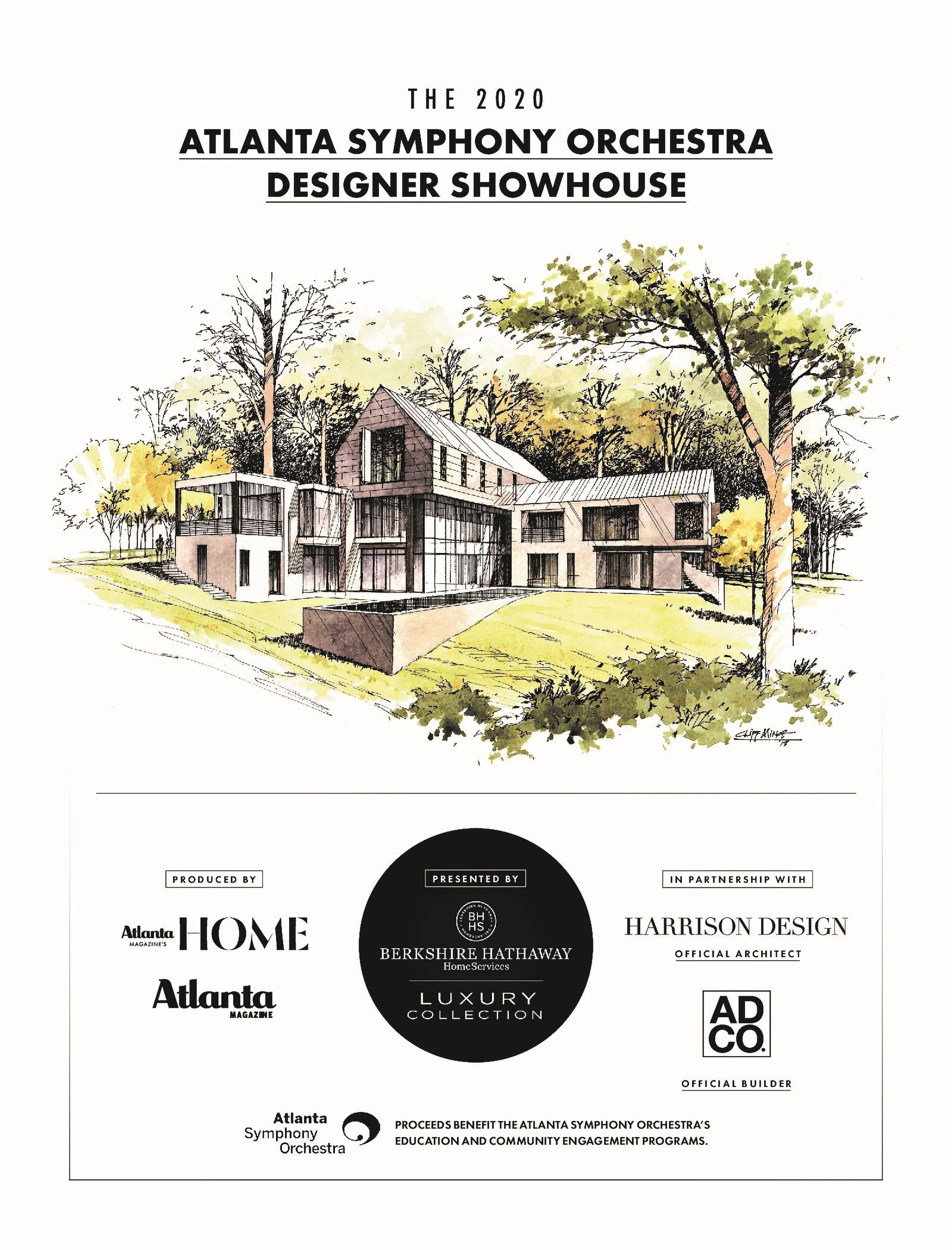
The 'Lowe' Down on the 2020 ASO Designer Showhouse
Author: Artsy Chow Roamer
The ‘Lowe Down’
ON The 2020 ASO DESIGNER SHOWHOUSE
Symphonies begin with one note;
Fires with one flame;
Gardens with one flower;
and Masterpieces with one stroke
Philosopher - Matshona Dhliwayo
The 2020 Atlanta Symphony Orchestra Designer Showhouse opened on Saturday, February 29th with champagne corks popping, phone cameras flashing and designers walking the red carpet. Clearly it was an exciting time for both the Symphony, the designers, Bill Lowe Gallery and the visitors. This post we take a look at what goes into finishing the beautiful spaces the designers create with a fabulous artwork program.
Produced by Atlanta Magazine and located in the posh area of Buckhead, the very modern home was designed by architect Robert Trescht of Harrison Design. Using the music of Rossini and Schubert as his muse, the architect has created an homage for the ASO’s 75th anniversary that was inspired by a 1945 Atlanta Youth Symphony performance.
SOUTHEASTERN DESIGNERS PROVIDING A LIFESTYLE
ADCO Construction has brought the contemporary vision to life while a gaggle of 22 Southeastern interior designers have provided a lifestyle within the big open light filled spaces. Water is featured in the back with a view from every space. In an unusual turn, the artwork program comes through a Concierge Curatorial Service provided by Bill Lowe Gallery located on Miami Circle in Atlanta.
BILL LOWE GALLERY PROVIDING ARTWORK PROGRAM
Bill and I go way back to the days of my own gallery when a lot of us were down on Bennett Street surrounded by shabby chic antique and rug shops. It was fun to sit down recently and rehash old memories. I laughingly told him his move out of Tula was the end for us lampreys eating off his shark carcass and it was never the same without him.
Lowe is celebrating his own anniversary of 31 years in Atlanta along with a stint in Santa Monica. With an international reputation for curatorial skills and visual drama in his exhibitions, Bill is bringing that same eye to the task of creating symphonic harmony in the spectacular spaces of this contemporary home.
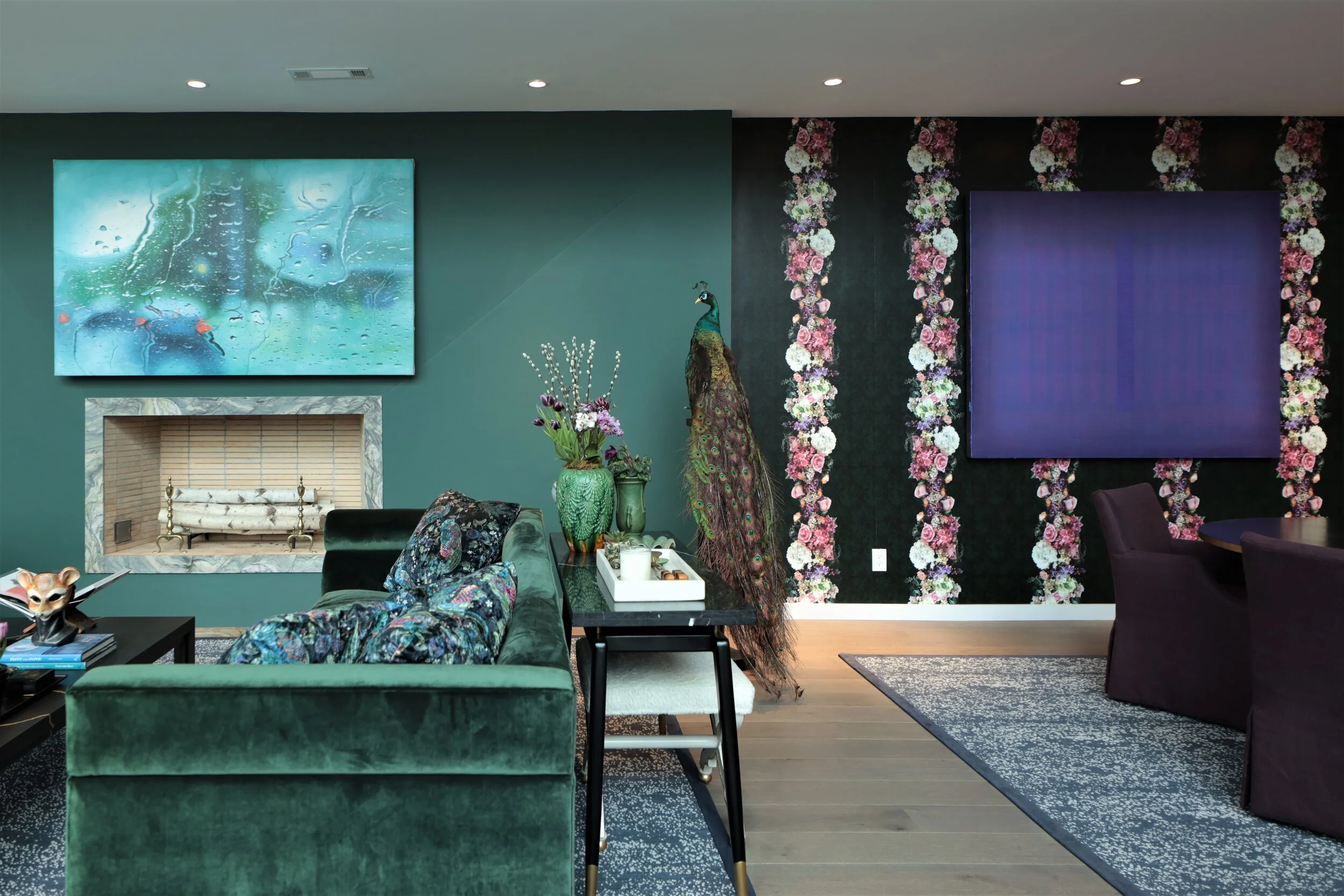
The process has found him meeting individually with each of the designers to look at their visions, textures and colors meant to compliment the architecture. He has then provided his ideas of the best among his artists to reflect both the interior and exterior of the house. Bill gets excited when he talks about this process. He clearly enjoys what he does and the efforts necessary to do it well.
In all fairness, he is a showman. He knows how to hang an exhibition or capture the individuals personality with whom he is working when pulling together an art collection. His stable of artists provide just the right notes for this adventure; they cause a visceral emotional response and there is the sheer physicality to them as well. (Think really big or sort of tiny here.) In other words, they make you stand up and take notice.
A FAVORITE SPACE-THE STUDY
A few favorite spaces that have evolved include The Study, designed by Cloth & Kind, which highlights a beautiful collection of tribal antiquities in the surrounding bookcases. Bill was charmed by the enthusiasm of the designer, Tami Ramsay, as she looked over the wide array of choices he had to offer. A few highlighted below include a Dan Tribe Fetish Figure head detail and a Tellum (Pre-Dogon) Figure from the 11th-14th century.
PEACE DESIGN PUTS THE MODERN IN COMFORT
The Master Bedroom and Bath were designed by one of Atlanta’s favorites, Bill Peace, turning out to be both modern and sophisticated but cozy and comfortable too. Not what traditionalists used to think about contemporary design. Bill tried to imagine who would live in the house and selected the artwork with Lowe for a well-balanced finish. Large portraits with titles like No More Words and Shelby 7 are both unusual and beautiful. They pair well with sculpture by Margarita Checa and the soft abstract paintings of Steven Seinberg.
LOREN TAYLOR WANTS GUESTS TO RETREAT AND UNWIND
Loren and Carolyn (a daughter and mother team) of Loren Taylor Interior Design are tackling the Upstairs Bedroom 2. Their design concept is that extra bedrooms in a large home can often be re-purposed so they provided a refuge/meditation quality for their space so owners and guests could retreat and unwind. The soft blues in the painting called Floating Machine by Fernando Gaspar were a pitch perfect selection for their design.
HABACHY CREATES DOWNSTAIRS LOUNGE WITH ROMANCE
Michael Habachys’ inspiration for the Downstairs Lounge and Powder Room came from the Japanese Wabi-Sabi movement which honors the rustic simplicity and beauty in imperfection. Earthy organic elements blend beautifully with more modern moody lighting creating romance and a space that is perfect for drinks and entertaining. The soft colors in the Herbert Creecy works on canvas reflect the Asian movement while the imperfection of the portraits of Mario Henrique are both beautiful and haunting.
CONCLUSION
Bill Lowe met the architect of the home at a private event he held in the gallery. When he saw the pictures of the sleek modern home Trescht was designing he was inspired to offer his special kind of curatorial services. He simply loads the trucks with everything he thinks might be a possibility and they place and hang the selected works until the client is happy with the results.
He likes that collaborative effort in a home installation, especially where the rooms open into each other, and the finished effect is a sort of choreography that has cohesive and coherent flow. He wants the house to read just like a “musical composition”; every piece of art forming a “beautiful symphonic overture”. Having seen showhouses in the past where the artwork was the last thing anyone thought about-Lowe wanted this one to be different-and it is. Don’t miss it!
Enjoy a video of the showhouse
The showhouse will be open through the end of March. The hours are Thursday-Saturday 10-4 and Sundays from 12-4. Tickets are $25. See the website for more information.
If you enjoyed reading this blog, you might also enjoy other posts under Artful Ideal. Be on the look out for a guest blog post from my British gal pal on her recent trip to Normandy, France. Hey, don’t be a stranger! Let me hear what you thought about the showhouse. Until next time…
Cheers,
ArtsyChowRoamer
To my Readers: This post was originally done in shorter form for my column, The Curious Corner, in the Arts & Entertainment section of Smoke Signals newspaper for 3/1/2020. At press time there were no finished space photos to use. I updated again 3/21/2020 with finished space photographs.
Follow me on You Tube, Facebook, Pinterest, Instagram & Twitter
Art
If you liked what you read, click on the button below!
Why? You’ll get free tips on how to start your own amazing art collection (even on a budget) plus other great stuff I promise you’ll want!


